
Real User
Feedback
We collected user feedback through a series of targeted questions, which helped us understand the reasoning behind the data from content square.
Competitor
Analysis
I analysed both direct and indirect competitors to identify market strengths and weaknesses.
User Activity
Data Analysis
Content Square was utilised to track user clicks and drop-offs, allowing us to identify what was working effectively and what needed improvement.
The Business
Goals
Gathered insights from key stakeholders on the current checkout process, identifying what was working well and areas for improvement.
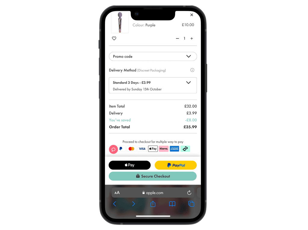
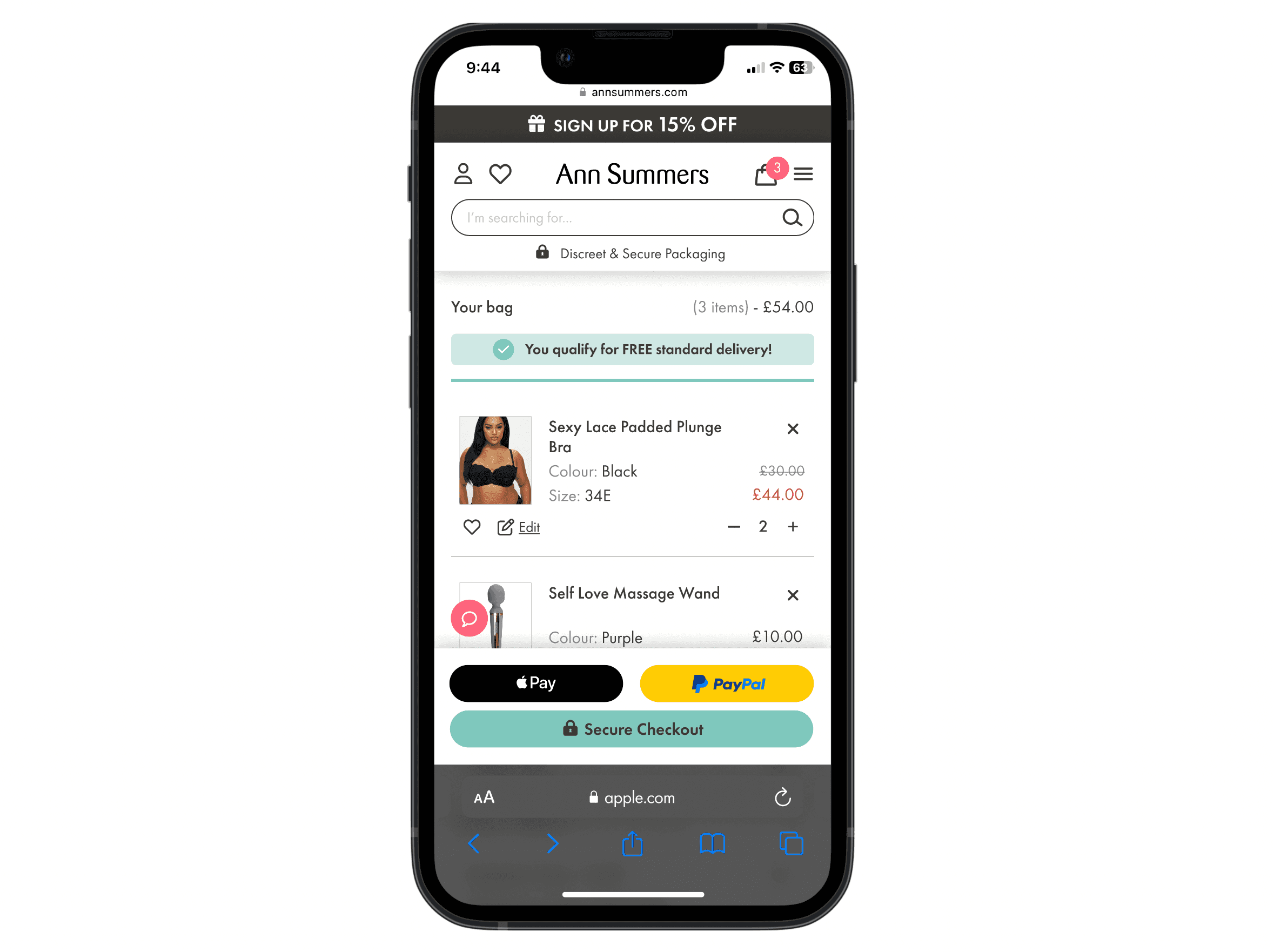
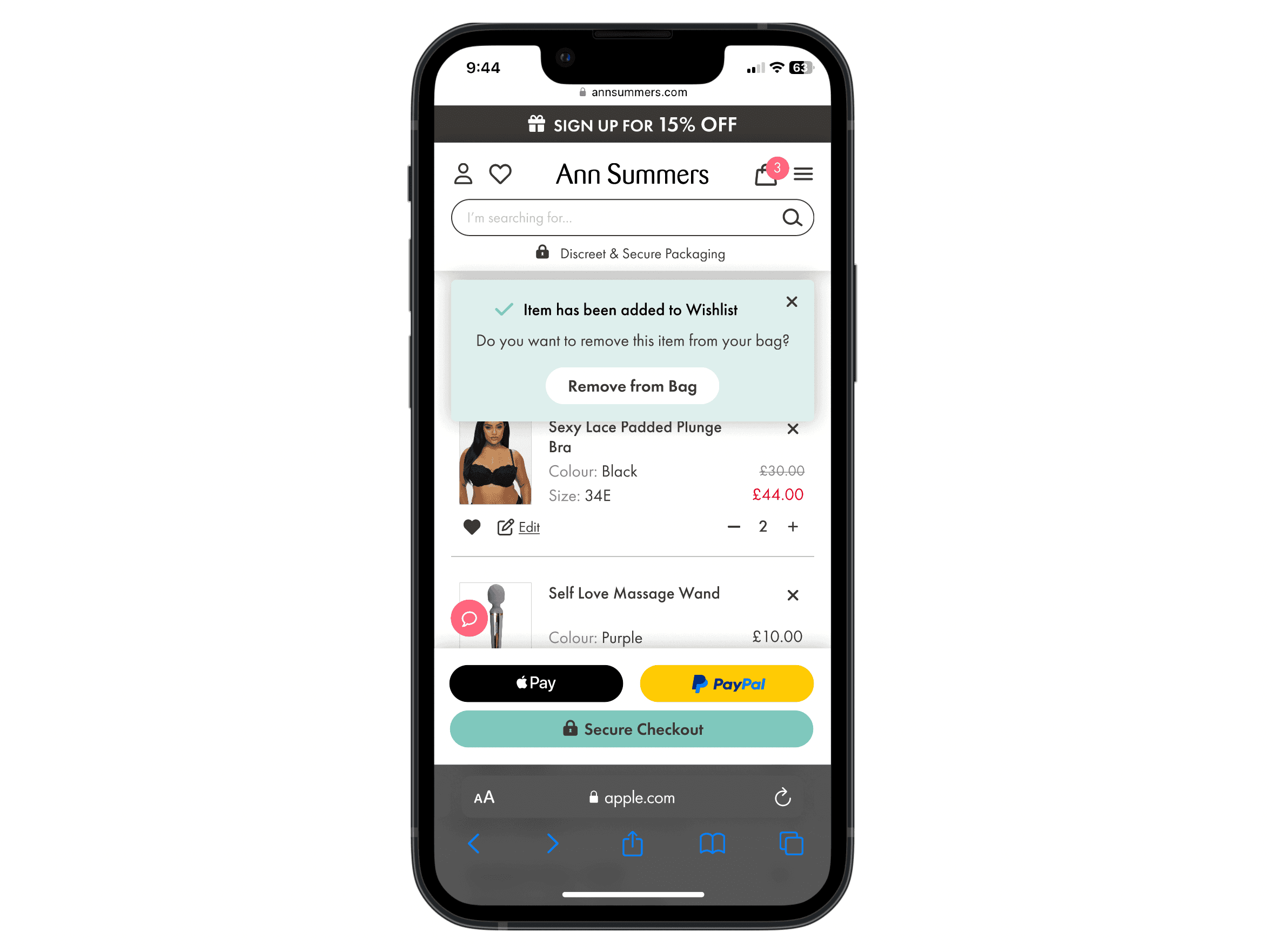
Cart
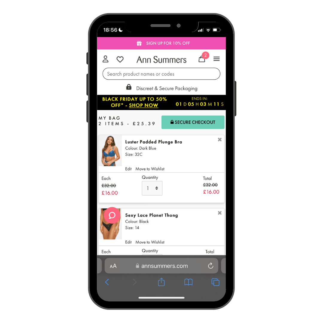
Before
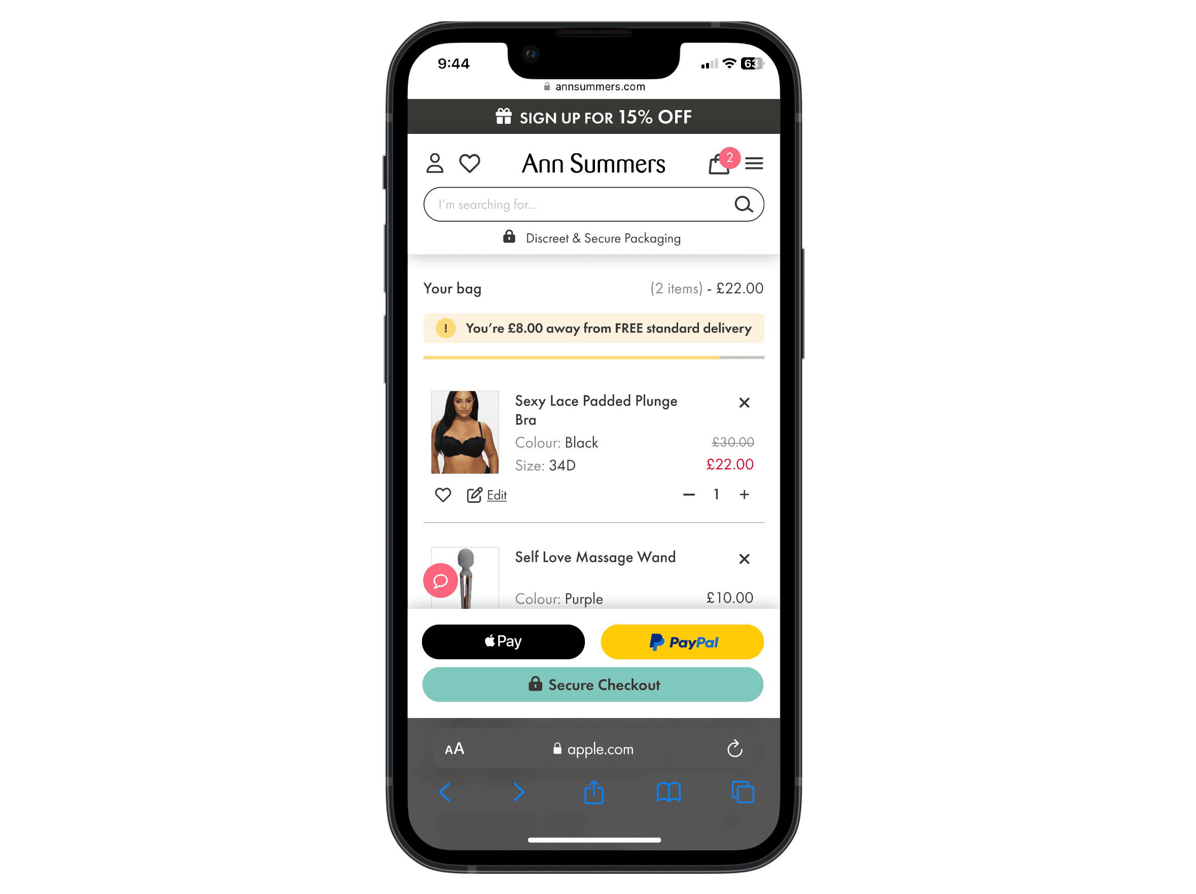
After
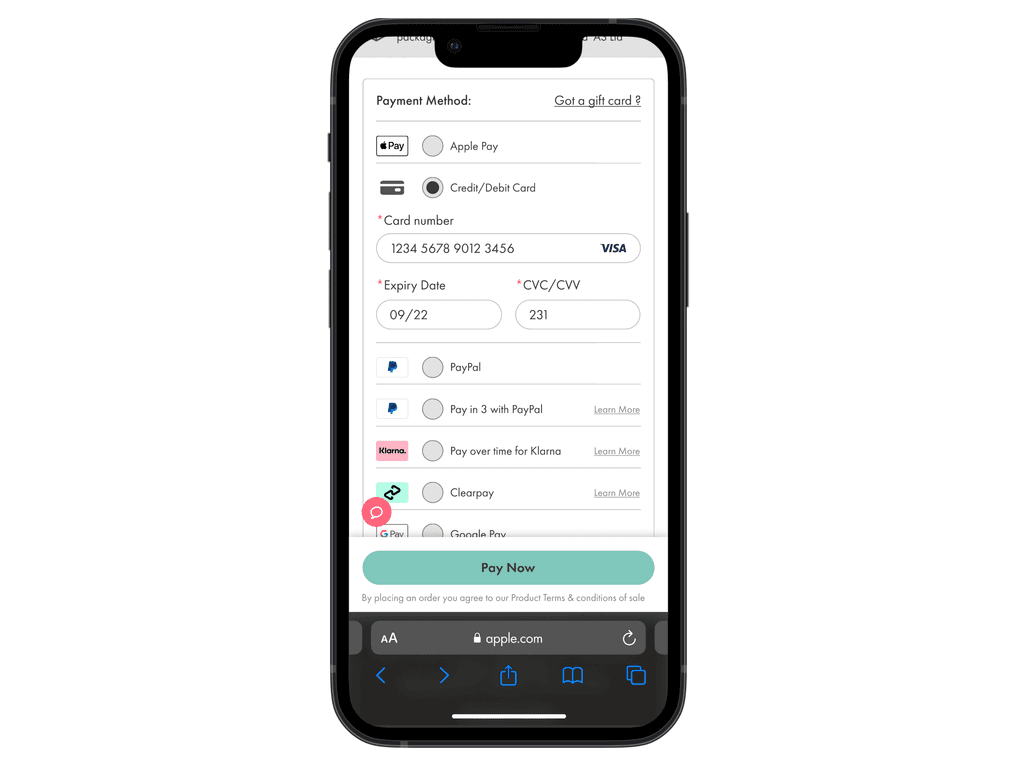
We aimed to boost the use of faster checkout payment options by positioning them prominently above the fold.
We also decluttered item tiles by simplifying features like Price, Wishlist, Quantity, and Edit functions.
We encouraged users to add more items to their baskets with the introduction of a new free delivery tracker.
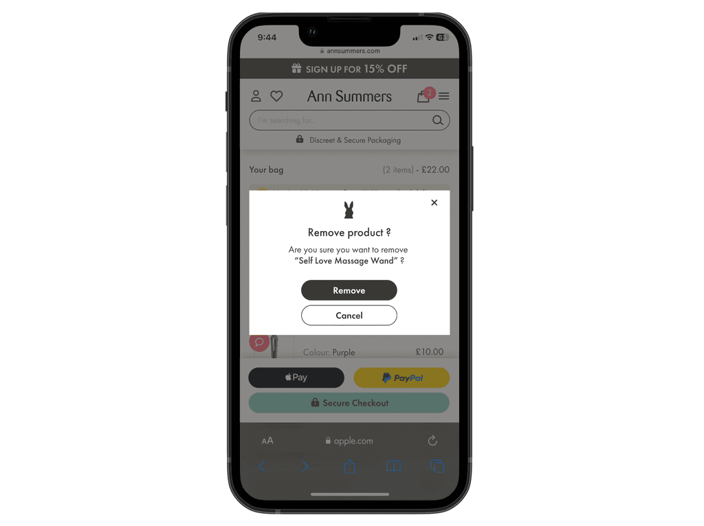
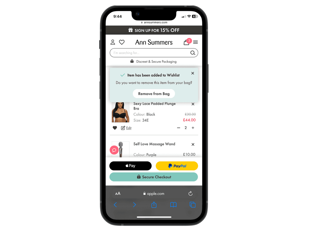
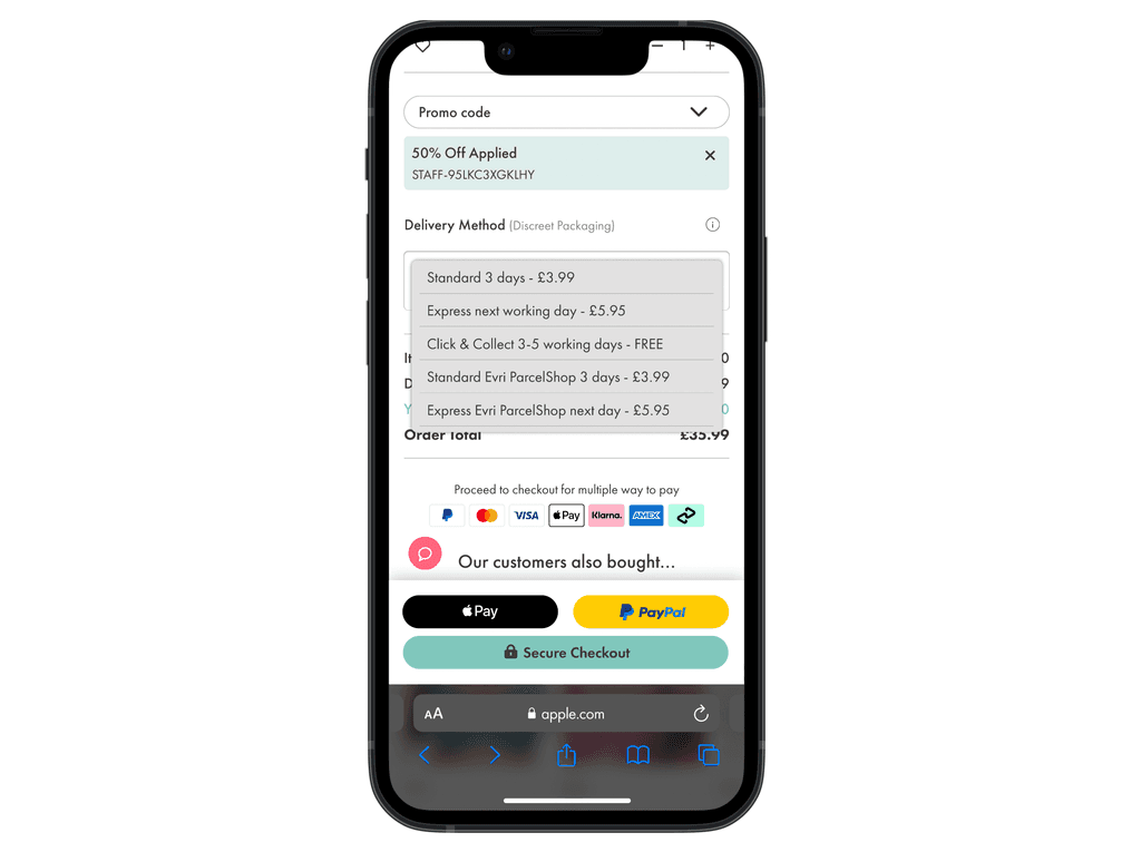
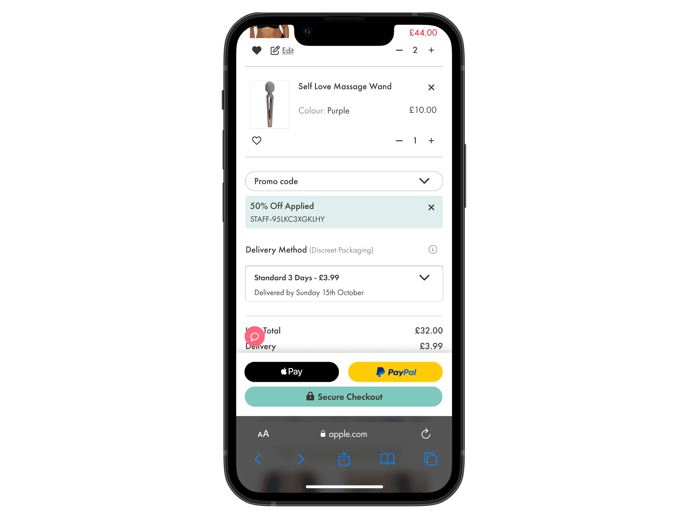
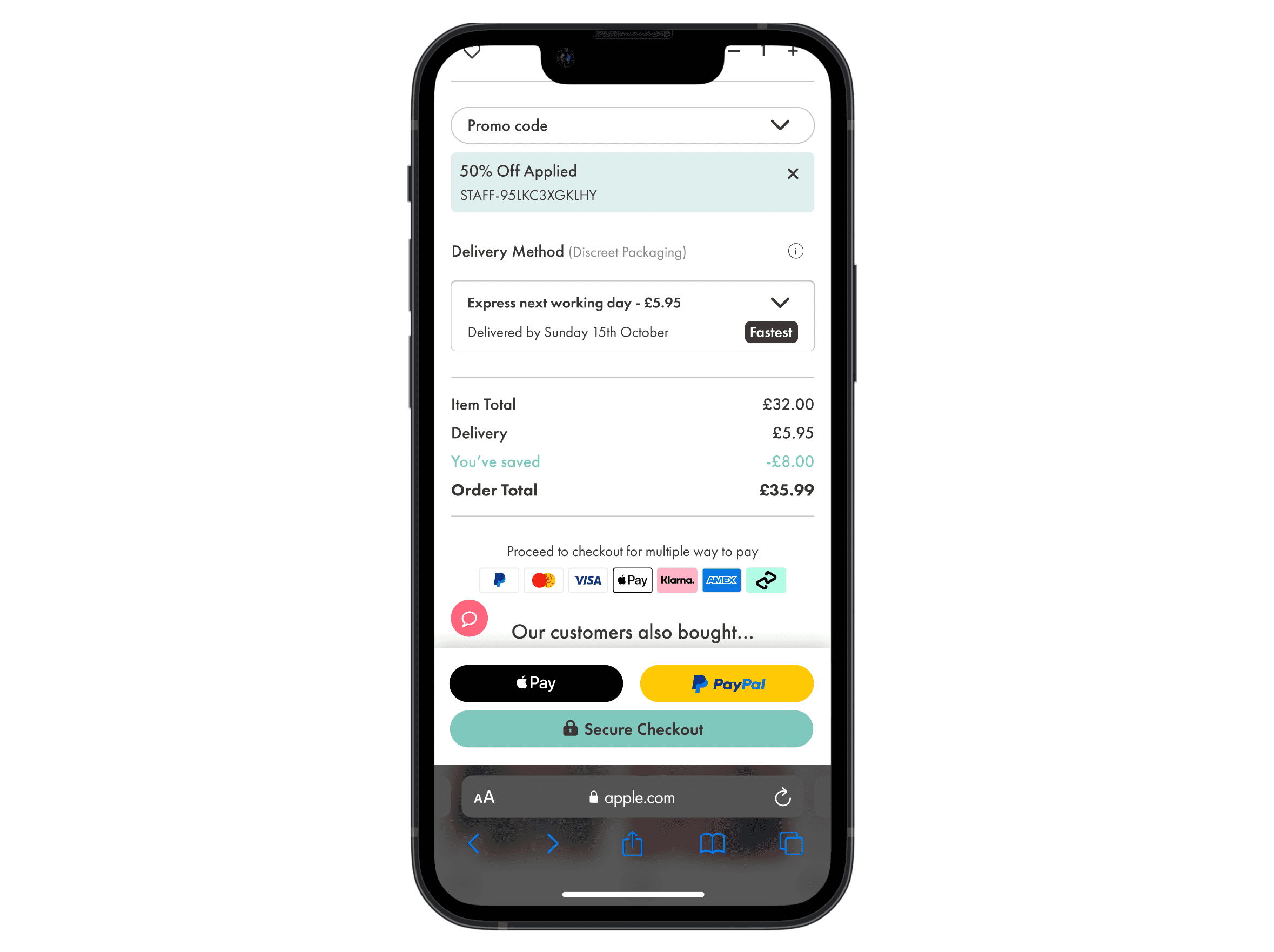
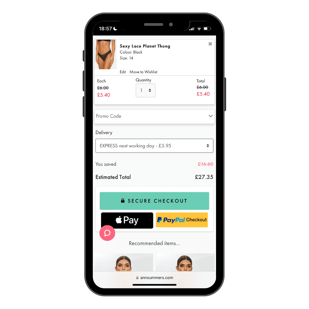
Cart
Before
After
Users can now explore delivery options without leaving their current journey.
The dropdown menu highlights the expected delivery date and includes a "fastest" method tag feature.
Alternative payment methods are now displayed.
Order totals are broken down for greater clarity.
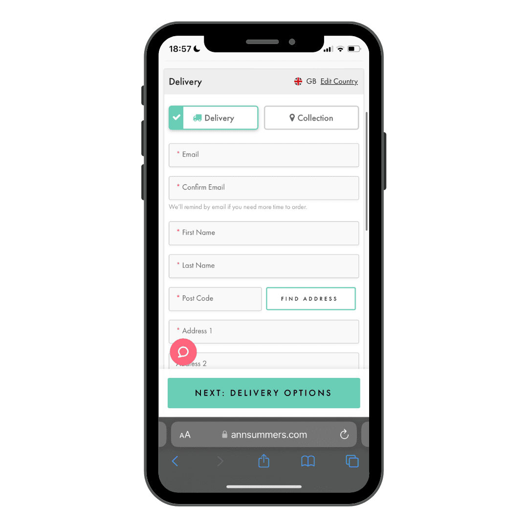
Delivery Details
Before
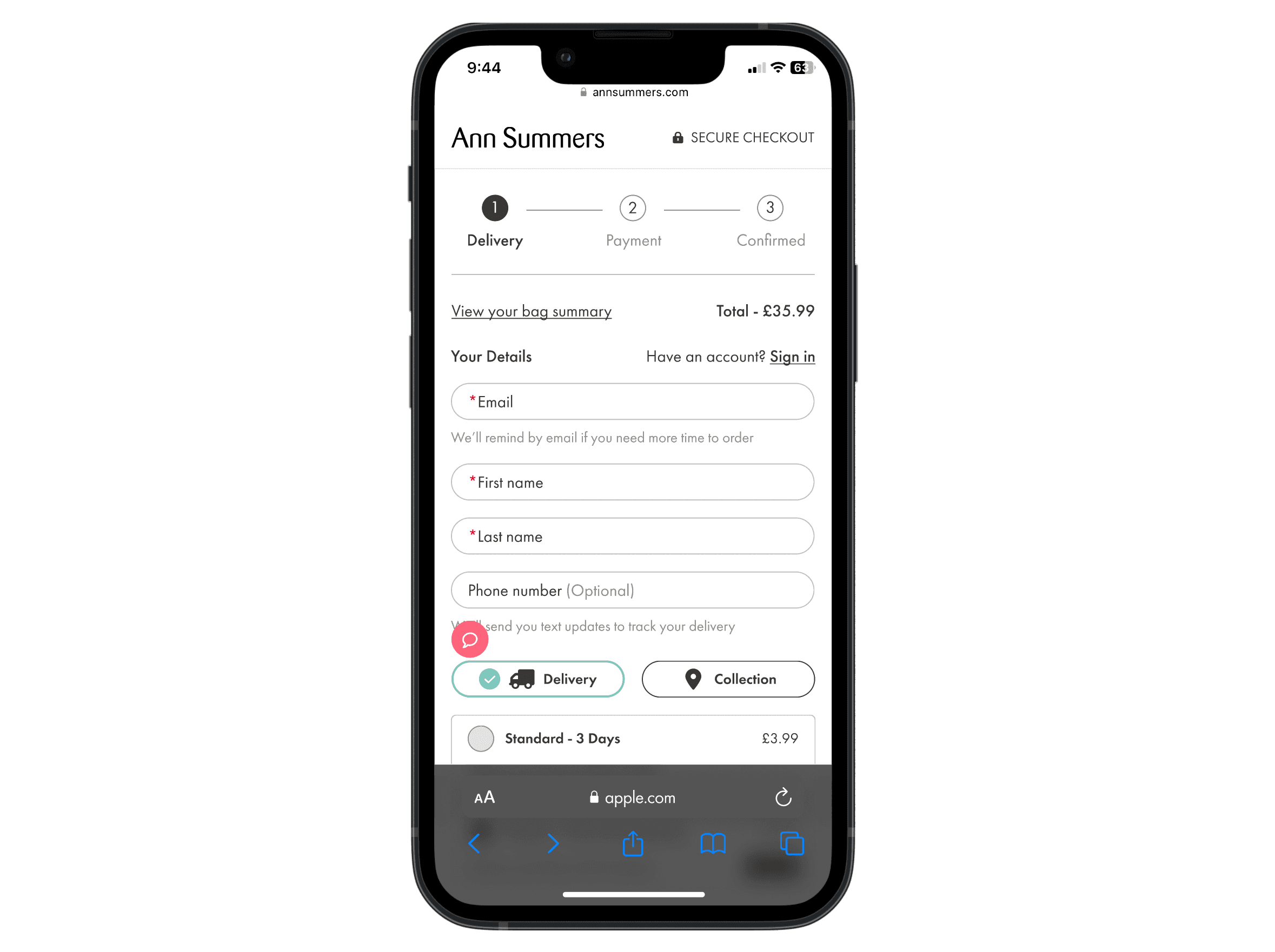
After
Users can now view more content above the fold.
The form has been minimised and hidden to encourage users to use the autofill feature for locating their address.
The shopping bag summary is now clearly visible.
The sticky CTA only appears when key fields are filled in, creating space for additional content.