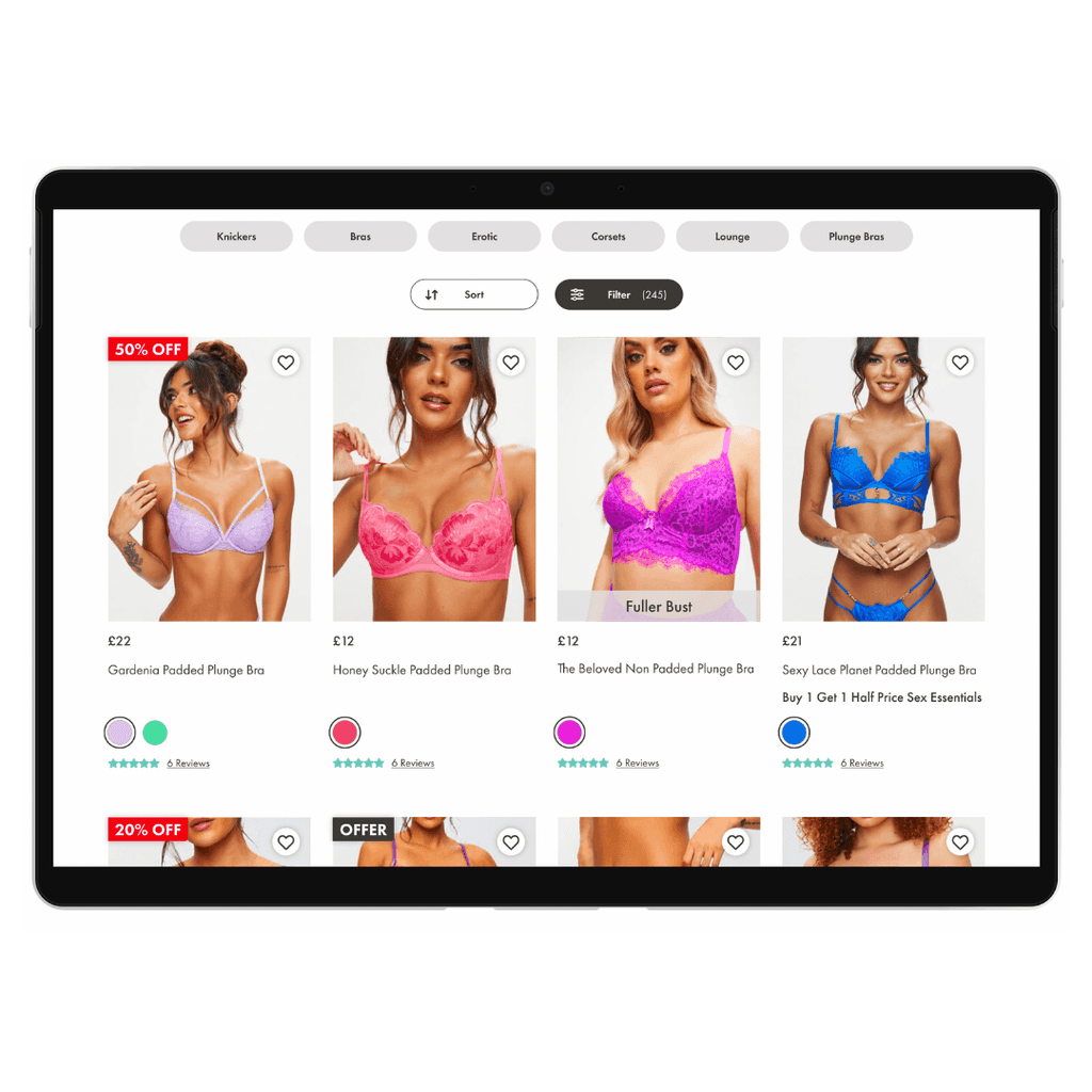
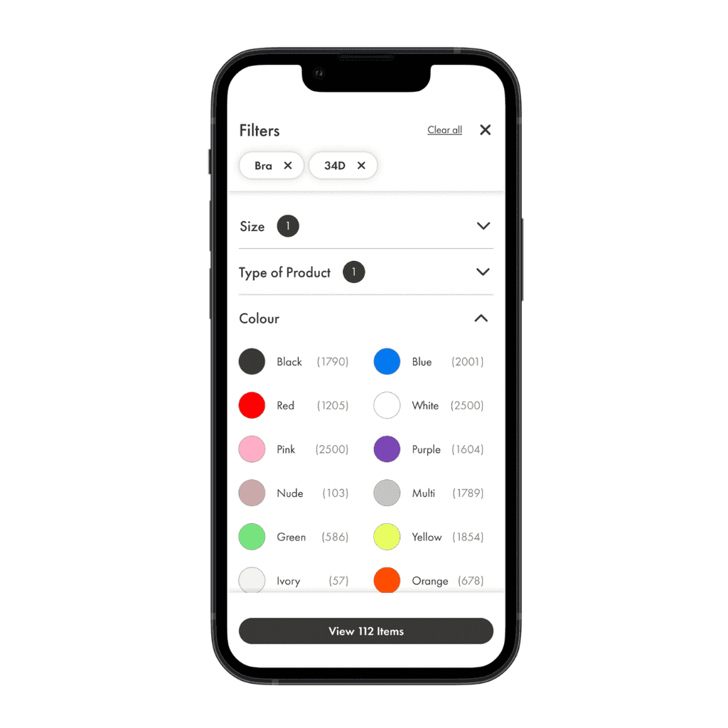
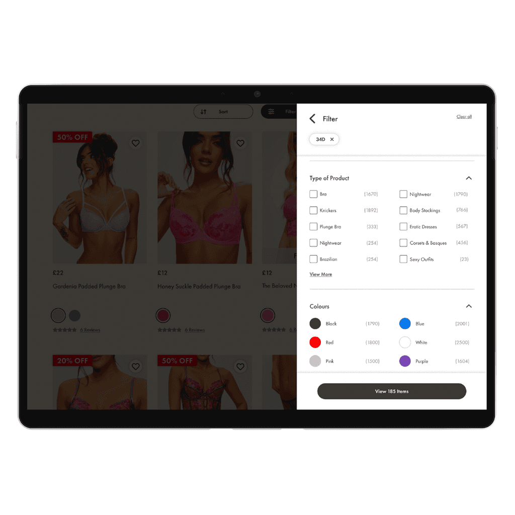
The page was initially launched to 50% of users and had performed consistently well. It was pushed live to 100% of our customer base and continues to improve site conversion and revenue.
User Activity
Content Square Data
The key purpose was to track where users were clicking, what areas were driving traffic and cash and where they dropped off on the journey. We quickly started to see what was working well and what wasn't.
Competitor Analysis
UX Audit
We looked into lots of direct and indirect competitors to begin to see what was best practice on this page. A list of the current bugs were used to drive the initial design changes.
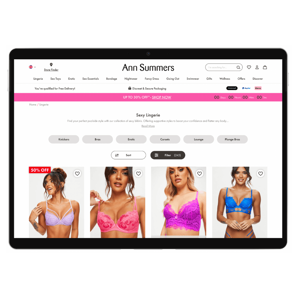
Top of the page
Before
After
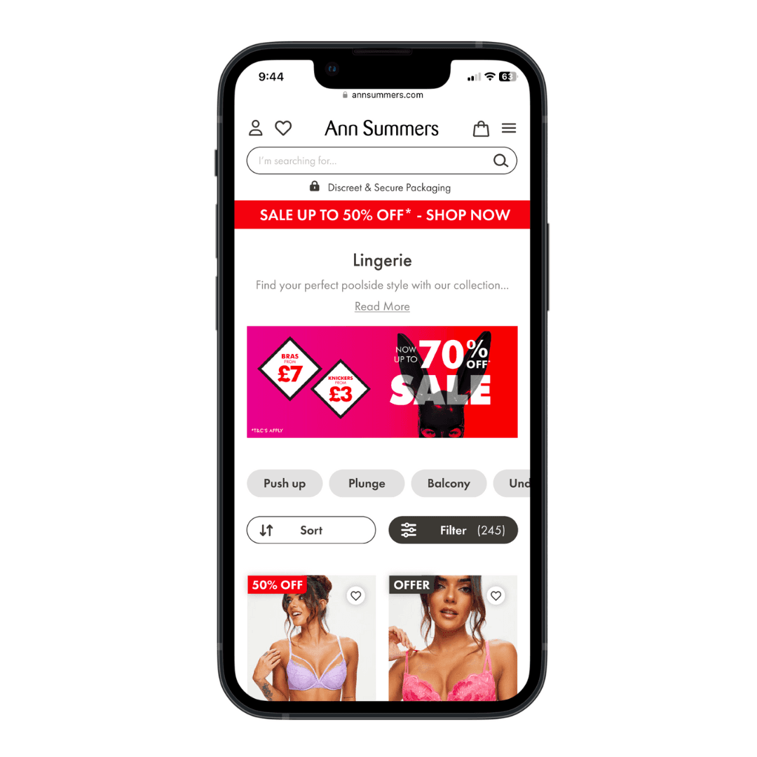
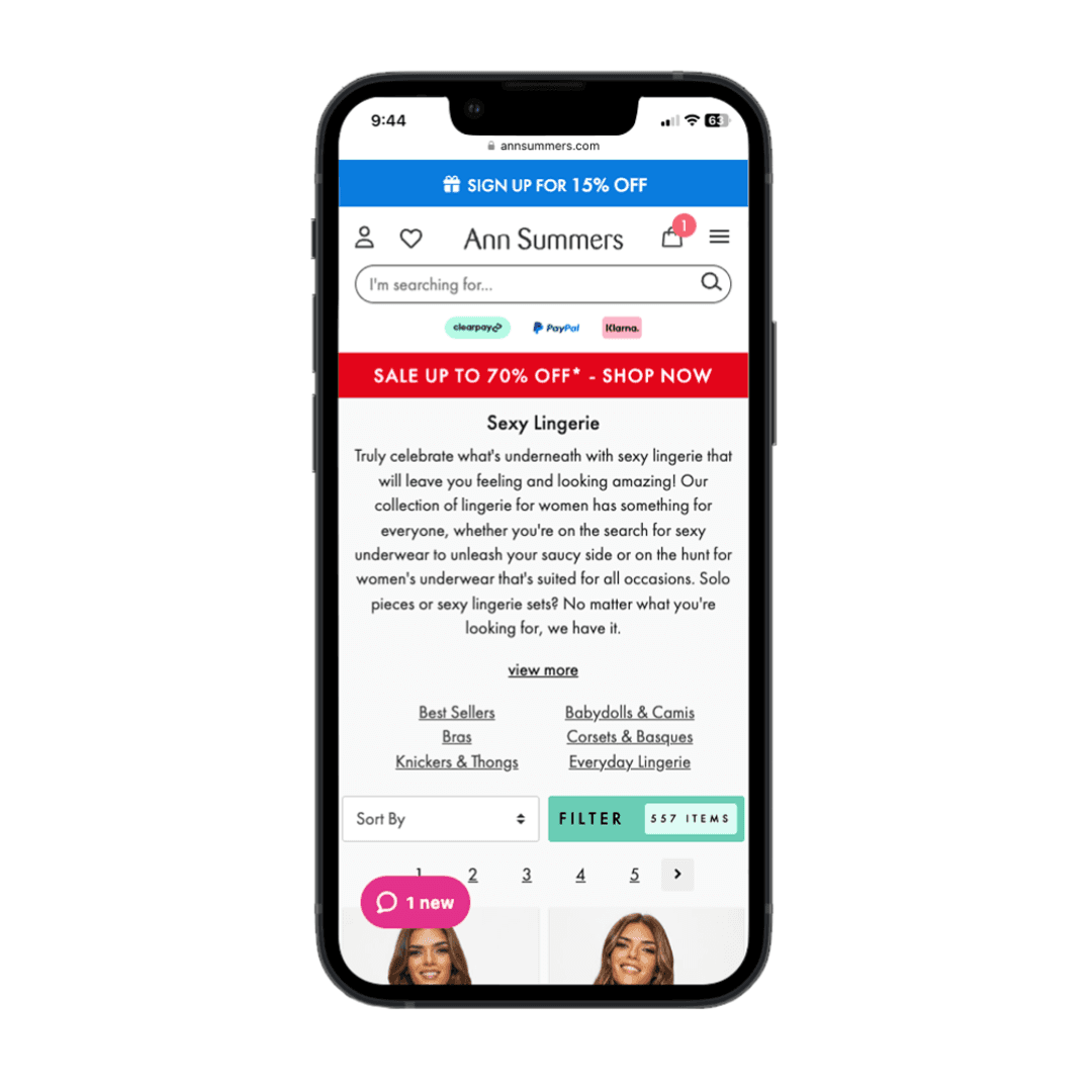
Got more content above the fold by reducing the SEO text to one line without harming the impact of the SEO copy, it is now hidden behind the "Read More" CTA.
Turned the quick filter links into a carousel so the users can swipe through further reducing space.
Removed the pagination to create an infinite scroll effect with load more appearing less frequently.
Items
Before
After
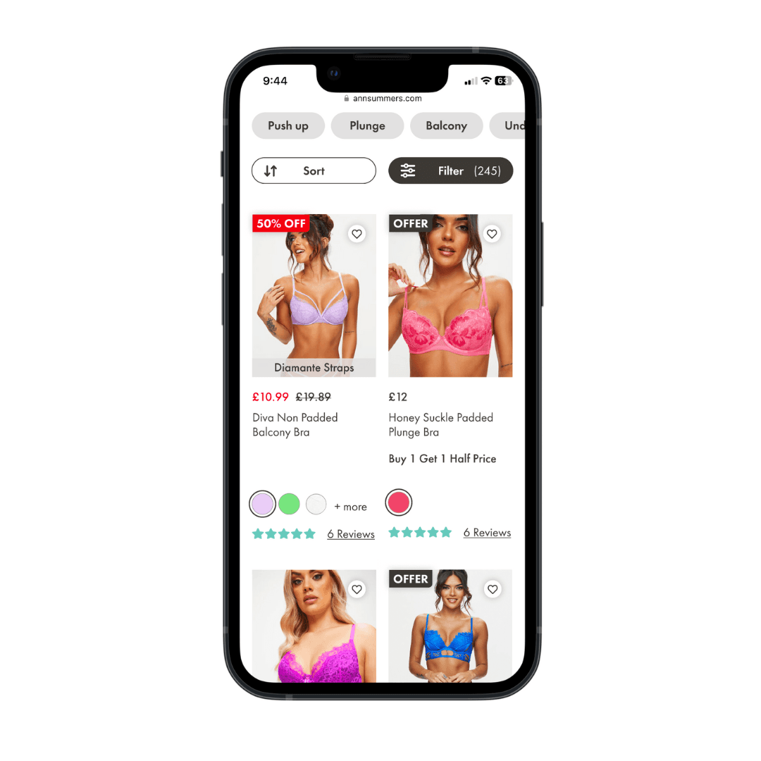
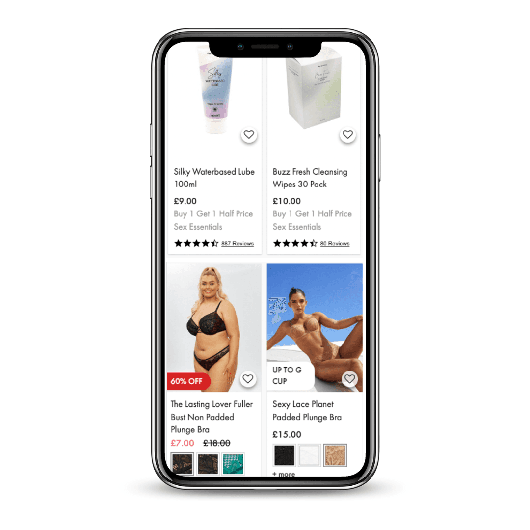
Feature call outs such as "up to G cup" now sit across the image giving more space for clear product photography.
Offer and % off messaging is now consistent in size and colour.
Review stars are more prominent as these were frequently clicked.
Colour swatches have changed to circles to match the page aesthetic and to be thumb friendly.
Filters
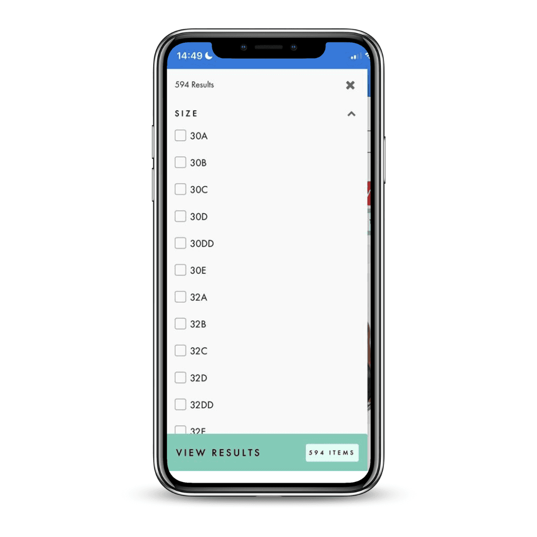
Before
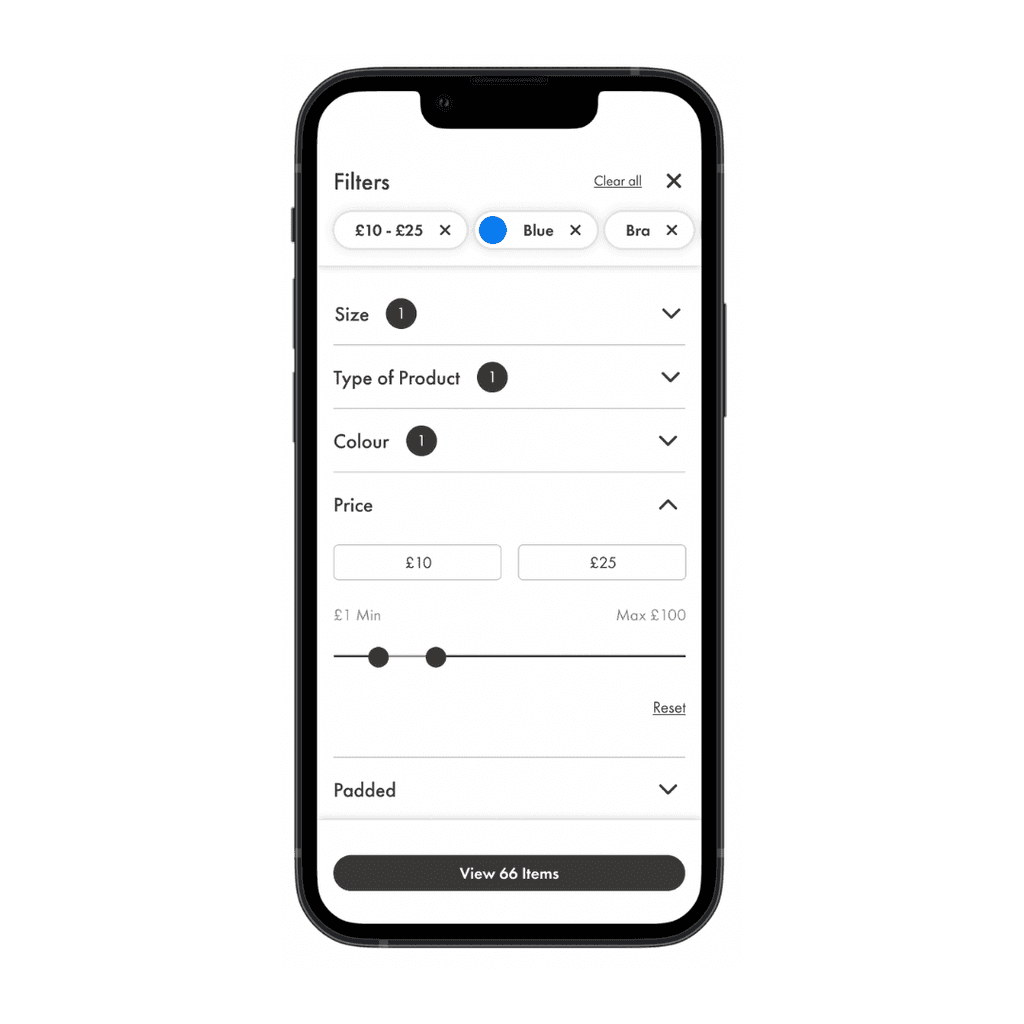
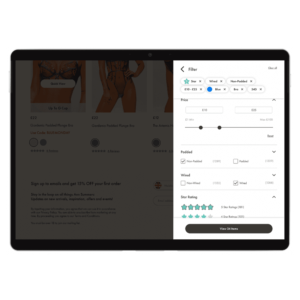
After
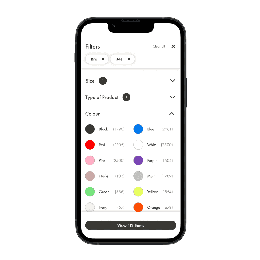
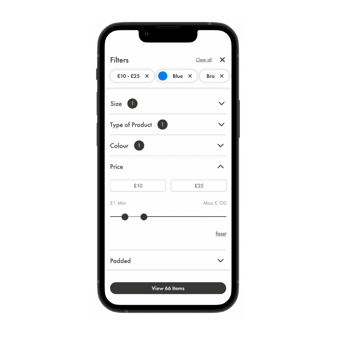
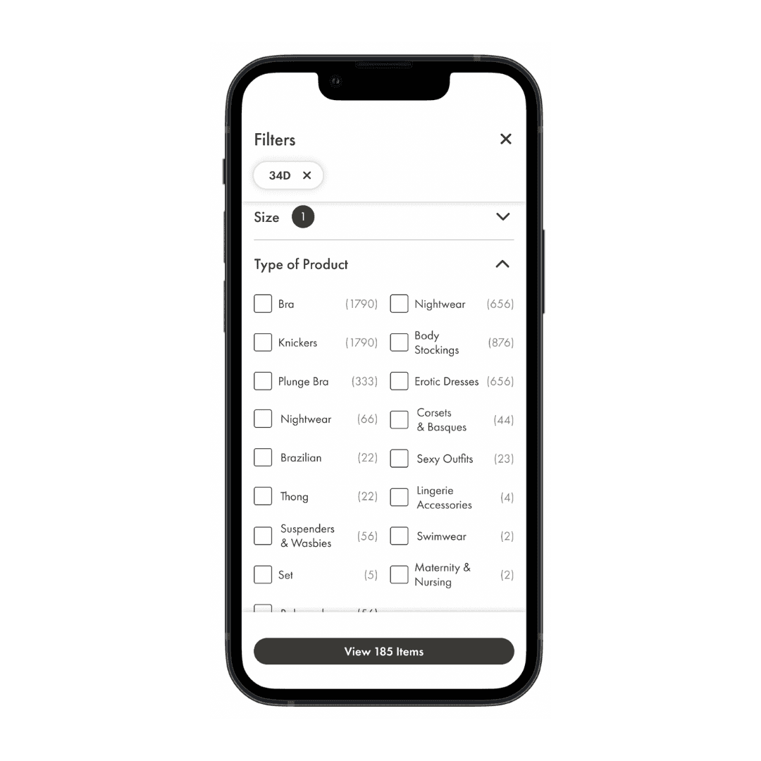
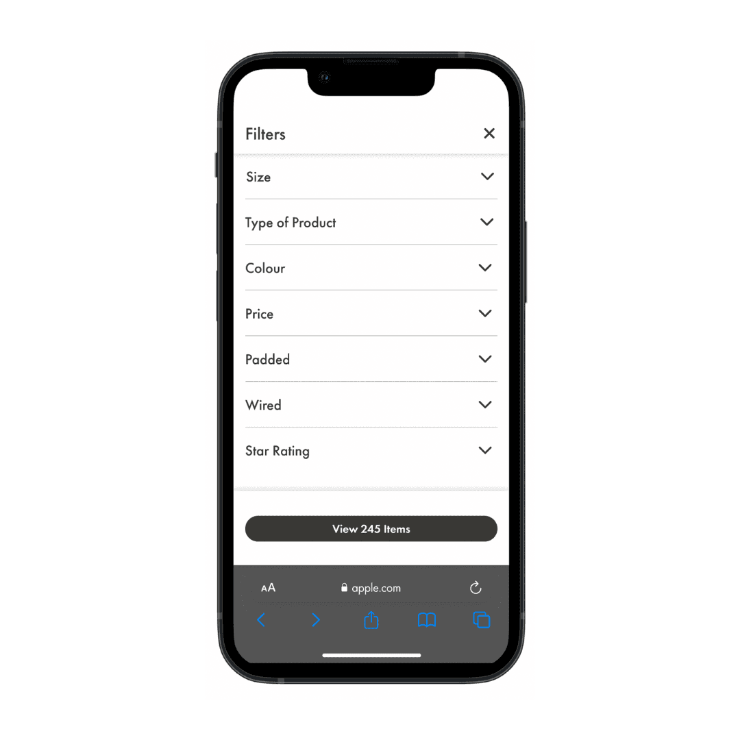
The filters now filter modal now fills the entire screen when opened.
The size selection filter now sits in 2 columns instead of one long list of endless scrolling.
User are now clearly shown the number of products alongside each filter to reduce users having 0 results.
The CTA is clear and full width of the screen to appear more user friendly.
