The
Problem
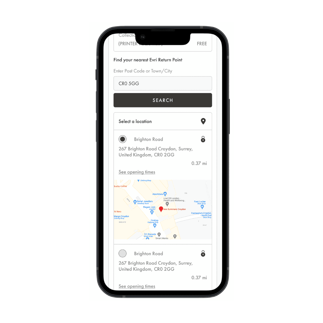
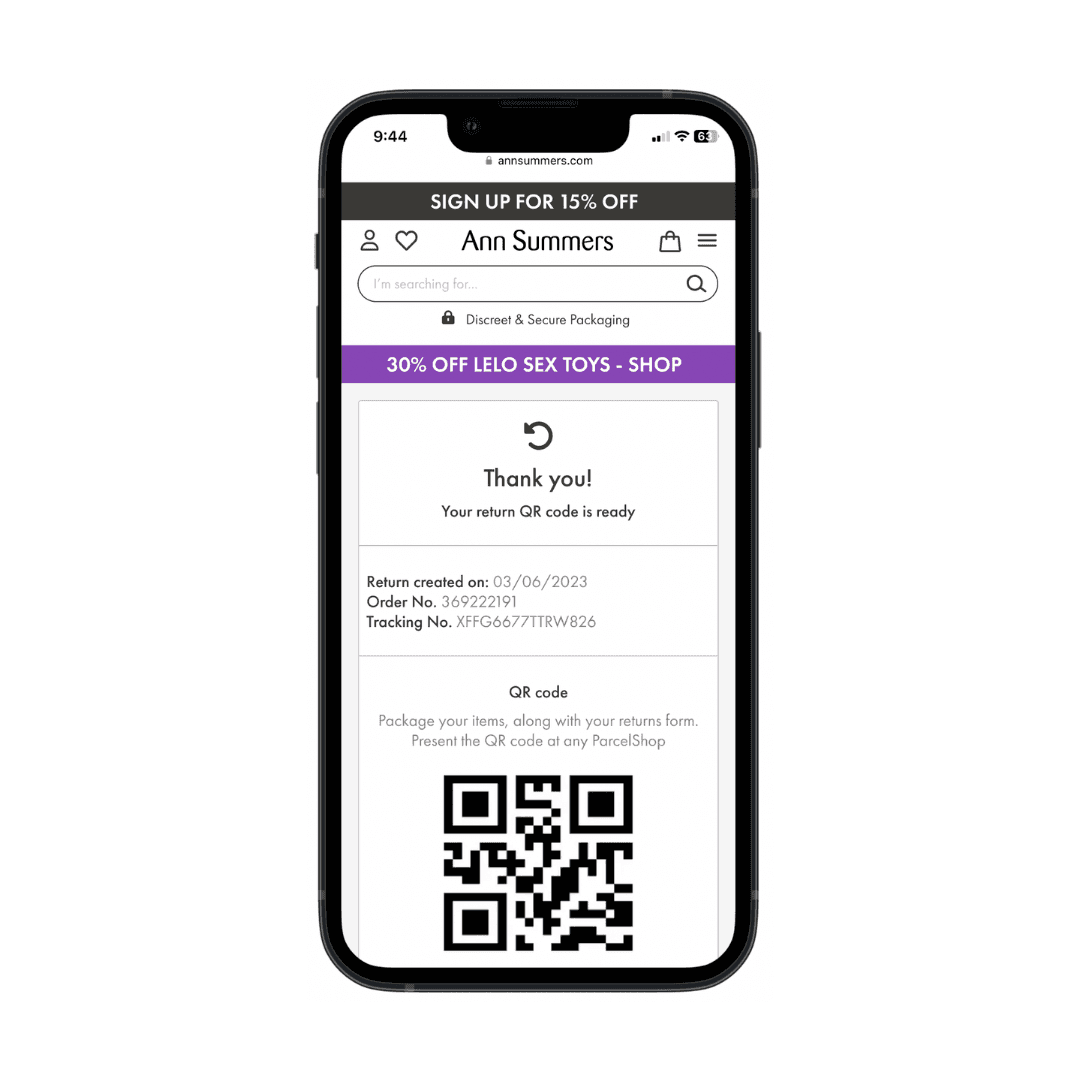
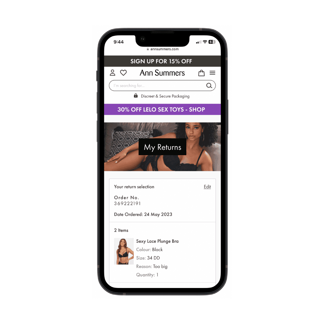
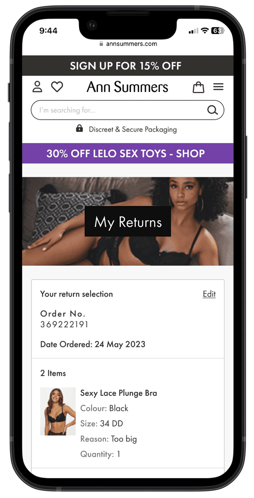
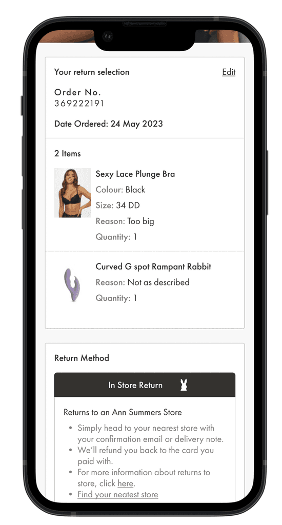
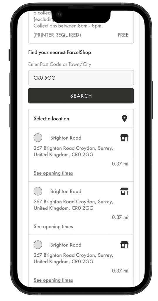
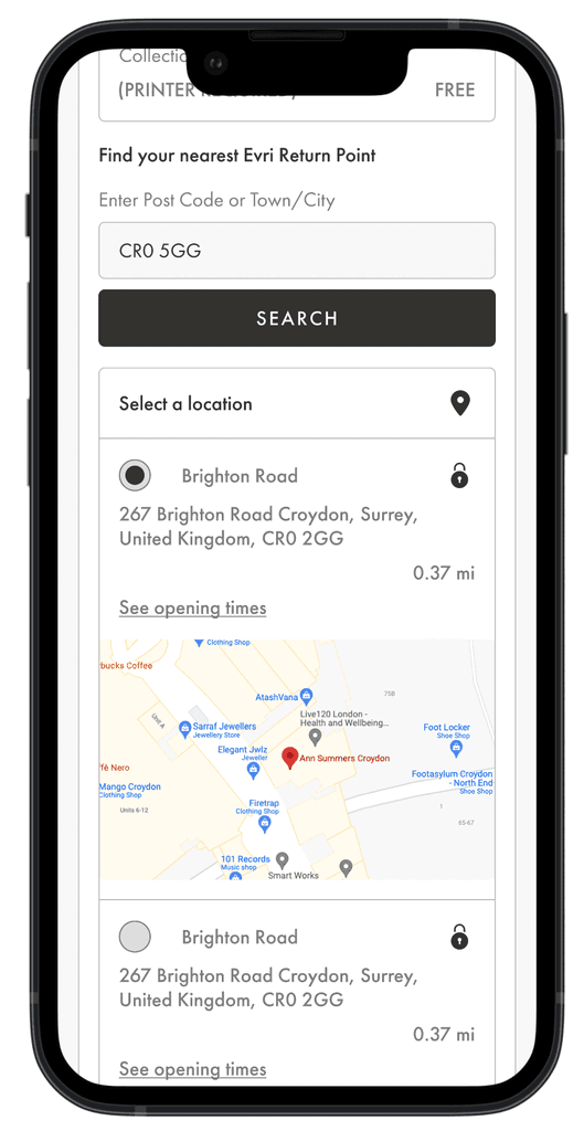
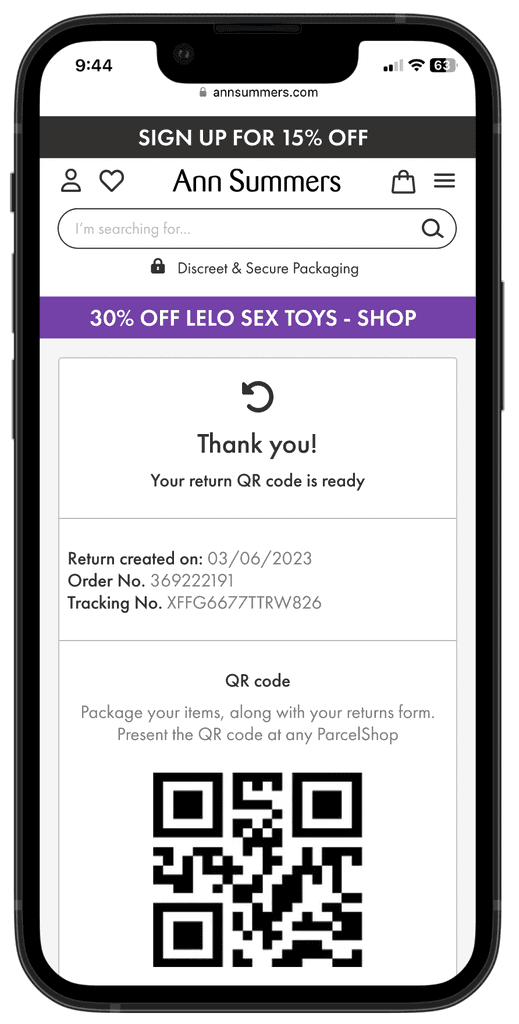
Our users are given a paper returns form when they receive their orders which can get lost. Orders are returned to the post office or in stores. The orders cannot be tracked, the user would have to wait for email confirmation.
Competitor
Analysis
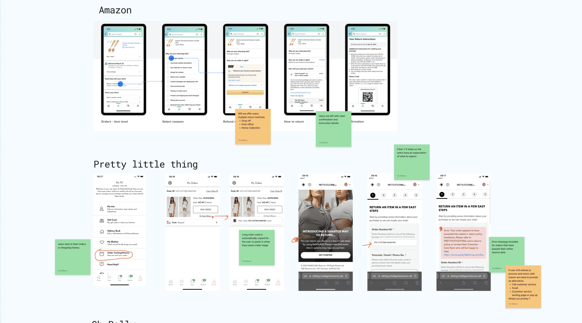
I analysed both direct and indirect competitors to identify market strengths and weaknesses.
User Journey
Map
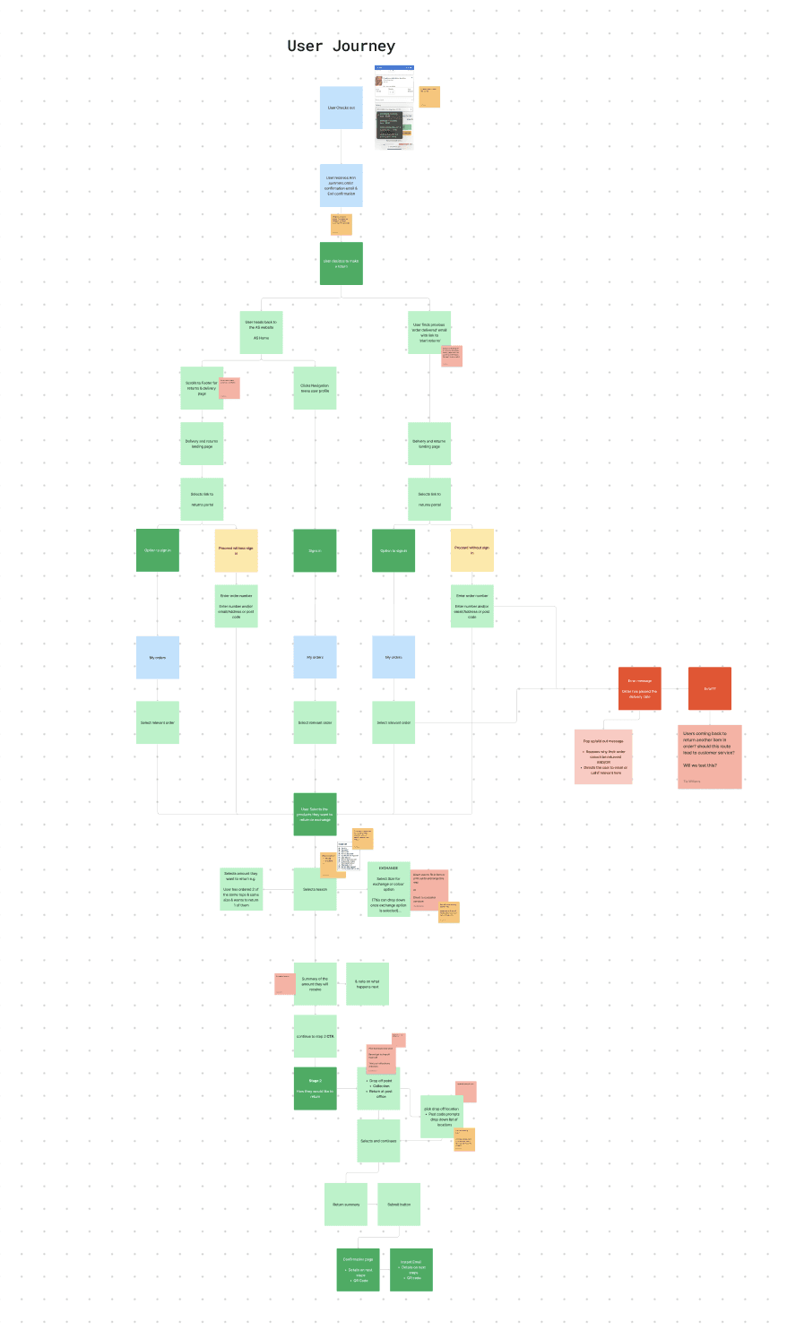
Visually mapping the current user flow and how a returns portal could be slotted made my initial proposal of the design changes clear.
Stakeholder
Feedback
The stakeholders on this project provided constructive feedback. I hosted a collaboration session and during the session we spent time adding to the user flow and chose a clear direction for the design expectations.
Updates
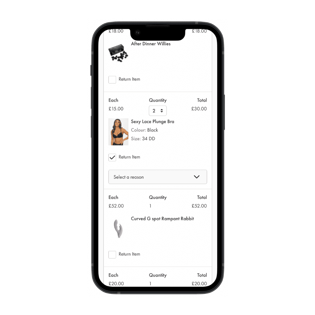
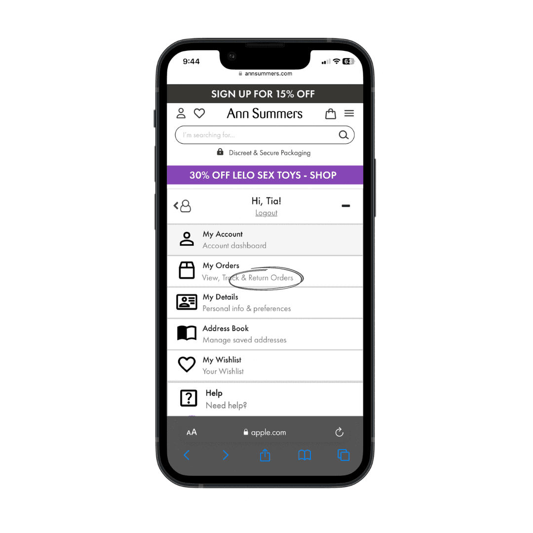
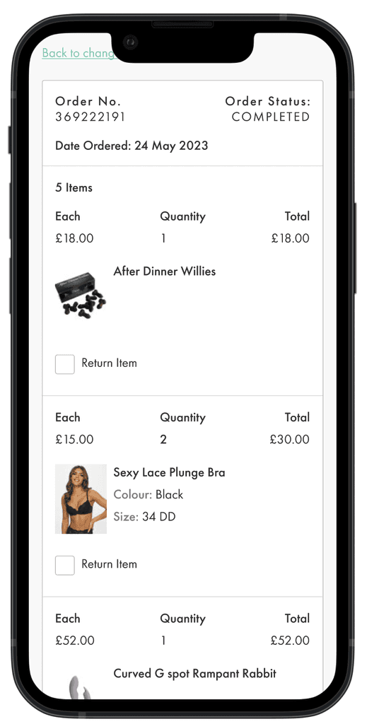
The competitor research showed me that users expect returns to sit within their previous orders.
An additional line of text was added to the original screen.
Minimal changes were needed on this screen due to research.
Updates
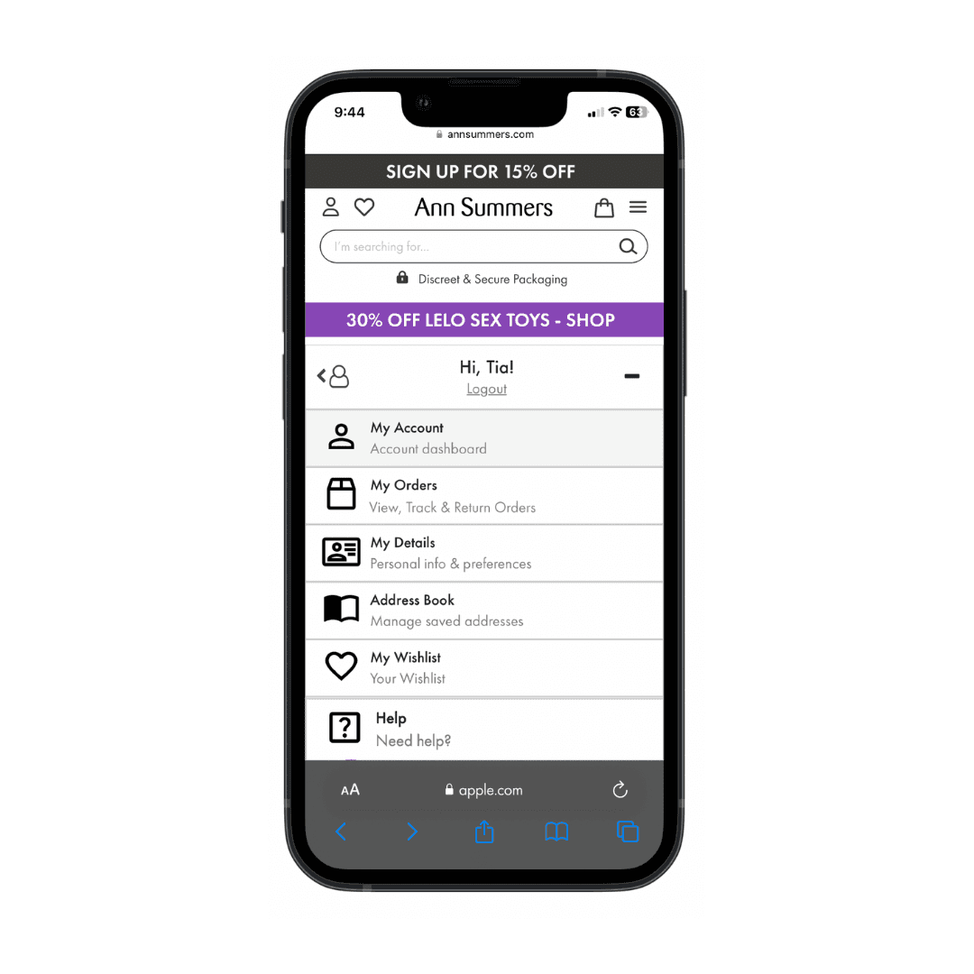
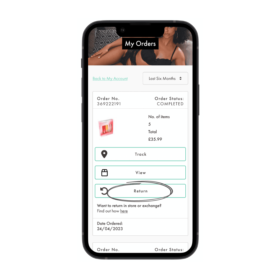
Returns were slotted in below "track" using the same styling.
This is the most conventional place for the user to find this button.
Minimal changes were needed on this screen due to research.
Updates
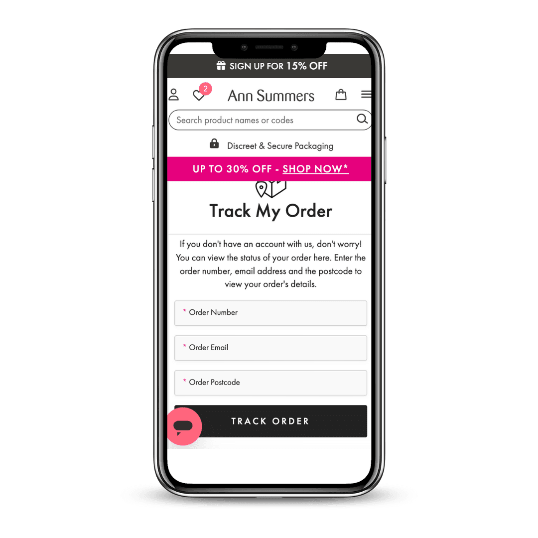
Before
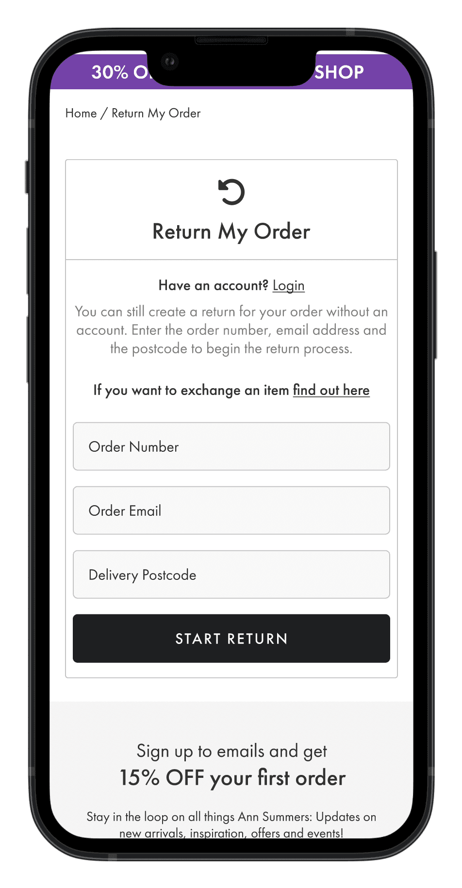
After
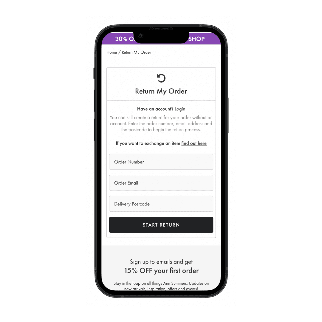
The Track my order form was already used during the journey so the template was also used to create returns search page.
We updated the copy and prioritised titles and text through size and colour.
